Planning Committee Member
pari passu, 2024-2025
Creator & Designer
Smeoow, 2021-2023
Artist Assistant
Bachelor of Fine Arts, Design
Interaction Design
User Experience
- Synthesize user feedback on pain points and unmet needs to identify design opportunities
- Develop user-friendly design guidelines as industry recommendations
- Prototype a website to aid reading and comprehension of EULAs
Difficult by Design
It might not sound all that surprising, but results from my primary research show that 5 out of 5 adults have “Accepted” a EULA without any plans to read it.
This is highly troubling especially when end-users say there are too many costly prerequisites for them to be able to fully read a EULA, such as mental capacity, legal education, and free time.
Time Equity for Public Health
Is having the time to read EULAs in itself a marker of class? In their article, Kleiner and Pavalko argue that time poverty discriminately affects low-income households, leading to a host of social inequities and public health problems. Those in communities with less control over their time are likely to have to work more, leading to less time for exercise and, consequently, obesity, diabetes, and malnutrition.
Ask
how do different users interact with eulas? this query relates to several areas of focus:
- How do dark UX patterns affect the design of EULAs?
- What does a user-friendly license agreement look like?
- How does human-centered design overlap with business development?
- What do brands stand to gain from being accessible and transparent?
Prepare
Upon completion of the screener, discussion guide, and successfully recruiting participants by scattering fliers in Seattle’s ballard, capitol hill, fremont, and south lake union neighborhoods, I prepare to meet with each person for about 40 minutes.
participants are split into 3 groups based on familiarity with EULA conventions: low awareness, medium awareness, and high awareness. having each interacted with the same EULA sample (AirBnB), their user journey is documented using a combination of 4 methods: survey, observation, exploration, and interview.
Process
Once the interview transcripts have been analyzed, information is sorted into different themes. some valuable key points include:
- End-users are often deterred from engaging by time constraints, complexity, or inaccessibility
- Many end-users lack the incentive to read, thus assuming the eula contains standard terms
- Dark UX artificially creates pressure, commanding end-users to “Agree” before they can access a product
Analyze
as models of what to do and what to avoid, These websites help significantly in defining goals for pari passu.
each of them has a user flow that heavily leverages search engine and category features. Furthermore, their about page is placed in the footer alongside other legal information and resources. This tells me that it must be clear to the user what my website’s purpose is without requiring them to read a mission statement.
Share
I present my findings to 3 different rounds of panels with Cornish faculty and industry professionals, using insights organized in Google Sheets and data visualized in Figma.
Easily understandable, user-friendly EULAs build trust and transparency between software providers and users; not only improving overall UX but also strengthening engagement and compliance, ultimately enhancing brand credibility and reputation.
Act
The wireframe is created for mobile users as much of our free time is spent looking at a pocket screen. It is also a website, as opposed to another application to bloat your device.
I begin fleshing out user flows and prototyping interactions with Figma in March of 2024, following the design solutions distilled from my research and feedback received from panels.
iterate
Mini thumbnails of common EULA terms are a good base for digital sketches. Some icons feel successful after the second iteration, but others would take up to 9 revisions.
pari passu’s loud, colorful palette counteracts the rigid and dense formatting of written agreements. these colors are paired with more anonymous typefaces: a slab serif display and calm yet stylish sans-serif read.
Deliver
Completed in late April of 2024, pari passu is a part of the Cornish Exit senior Design BFA exhibition. Its entire research and design process is documented in a 64-page process book.
Accessible below, the prototype features:
- categorized database of eULAs with data visualization
- search engine tool
- public feedback system
- graphic standards manual for effective visual communication and humanized software agreements
Interaction Design
Surface Design
- Create new branding to encourage individual expression and playfulness in Seattle adults
- Define brand identity in a style manual
- Apply new assets to marketing as well as merchandising materials
Graphic Design
Interaction Design
Sam Morris
Felix Paz
Illustration
Interaction Design
Surface Design
- Establish brand identity, Visual Style, and core graphic elements
- Produce digital & printed materials for outreach and visitor experience
- Design a catalog of student projects using HTML/CSS
Graphic Design
Interaction Design
Paul Derieux
palette & treatment
Surface Design
- Orient brand identity within context of Vietnamese design
- Translate authentic charm for modernized style and assets
- Facilitate a more intuitive customer ordering experience
Original
The deli's main feature is an outdated menuboard that lists their many offerings in two languages. this numbered list is straightforward yet feels overcrowded, uninviting, and lacks hierarchy.
My goal is to make the menu browsing experience easier by expanding on the pre-existing number system, yet preserving its anti-design attitude.
Rebrand
Reminiscing about the long hot days in Vietnam, I went on a typographic exploration. I focused on cursive handwriting and lotus symbols as inspiration for this project.
Interaction Design
User Experience
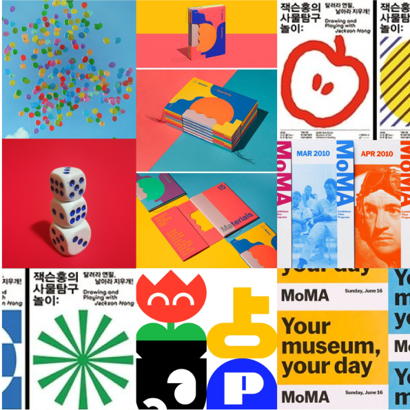
- Design educational tools to help young artists build an understanding of complex legal concepts
- Perform usability testing to evaluate and improve product performance
- Deliver physical and digital prototypes
Interaction Design
Research & Writing
Usability Testing
Usability Testing
Process
The team agreed that this educational product should be exprienced in multiple interactive elements: tactile flashcards in a protective case, an interactive poster with space for notes, and lastly a website for digital learning. All these elements require complex information to be broken down as much as possible for a lower text count while preserving the context.
Testing
Usability testing was performed with a screening focus on people of ages 16-24 who are new to or expecting to join the creative industry using a rough draft of the package. Some of the research goals include:
- Gathering user feedback on learning pain points and product functionality
- Observing user navigation of the website prototype and their comprehension of information
- Measuring user quiz scores to pinpoint ineffective teaching components and areas that lack clarity
Findings
The following insights were extracted from data that we collected through discussion sessions with a pool of 4 participants.
Our Learners...
- find fair use relevant to highly relevant
- find the product easy to handle, store, and navigate
- “find the poster useful”
- “find the illustrations helpful in facilitating learning”
- are “satisfied with information (they) learned in the amount of time spent”
- would use the product for personal reference
- would recommend the product to a friend or colleague
Surface Design
an autofictional health and lifestyle brand for clumsy adventurers of all ages, gender, and sexuality. sk8aid offers a small yet diverse selection of items curated based on my own taste and attributes.
- Design a brand that promotes physical and spiritual health development
- Facilitate a safe space for people of all backgrounds to make mistakes
- Mockup product line alongside eco-friendly packaging concepts
Let's grow togethersk8aid’s philosophy is led in equal parts by growth and security. Seeds cannot sprout in a stressful environment; To take care of others, start by taking control of your health.
Once a year, scientists closely work with axolotl sanctuaries in Xochimilco to formulate nature’s ultimate miracle. Our special ingredient is ethically sourced in small batches, ensuring future habitat integrity.
always travel-ready
more hair, less stress
ctrl+alt+del » Super sponge
dual-sided eraser for any texture, scar, or blemish
ctrl+r » cellular cleanser
one-step hair care with neurochemical properties
ctrl+z » recovery rub
quick-absorbing skin salve for overnight recovery
sk8aid for a greener world.
- Design seasonal products and marketing materials for a local dispensary
- Underscore brand’s clean-green Ethos with minimalist glyphs and symbols
- Recreate natural tessellation by organizing flora & fauna in circular grid
Typography
Synopsis The term banana is sometimes used to suggest that one is “yellow on the outside but white on the inside.” It is not an accurate representation of Asian experiences, especially given the diversity of native and diasporic cultures within the "Asian" population. this duo of essays centers the endless variations between yellow and white; negotiating what it means to exist in a material reality where Asian success often comes at the cost of Black failure and displacement of Indigenous peoples.
Set in Pragmatica, a sans-serif type family created by Alexander Tarbeev, Manvel Shmavonyan, Olga Chaeva, Vladimir Andrich, and Vladimir Yefimov for digital foundry Paratype.
Edition of 3, printed on copy paper on the Xerox Phaser color laser printer and handbound in the Cornish Book Arts Studio.
Edition of 3, printed on copy paper on the Xerox Phaser color laser printer and handbound in the Cornish Book Arts Studio.
regular
bold
italic
credit must be given to the creator.